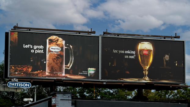
Design has a proximity problem: The closer you are to your own brand, the harder it becomes to see what it is actually signalling. Bruce Mau Design (BMD) has built its practice around solving that problem, starting before a single design decision is made.
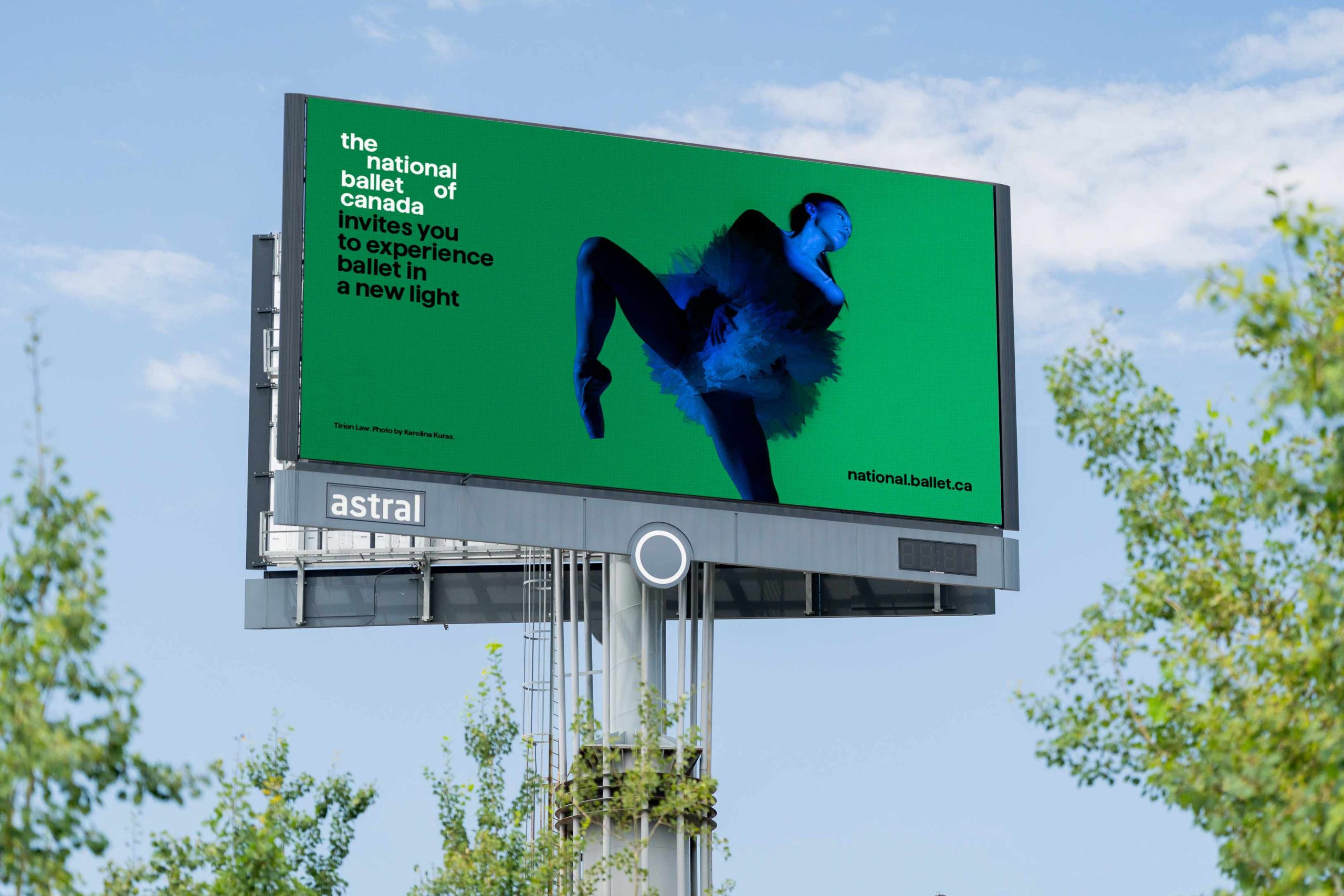
To appeal to those unsure about attending the National Ballet of Canada, BMD created a wordmark that doubles as a storytelling device, with vibrant jewel tones and a strong yet beautiful font.
“We begin every project with deep immersion,” says Laura Stein, chief creative officer and partner. “We often embed ourselves with our clients in a pop-up studio for an intensive period of discovery. We engage stakeholders across the organization, analyze internal materials, and uncover the insights and dynamics that are shaping the customer experience.”
That inside-out methodology is what separates BMD’s definition of strategic design from the industry’s more generic use of the phrase. For Stein, strategic design means using brand as a tool to create meaning and drive real business outcomes. “We don’t start with aesthetics,” she says. “We start with intent.”
This approach is visible in the breadth of what BMD delivers. Where many design practices build visual identities, BMD builds holistic brand systems, designing everything from identity to digital, spatial and service touchpoints so brands show up consistently in every environment. In Stein’s framing, identity is not a visual expression but a cultural and experiential system that drives how an organization behaves, communicates and connects.
In the case of Toronto Pearson International Airport, the brand had fragmented over time into a tangle of sub-brands, each with its own logo and visual language. The mandate was to bring clarity back without touching the existing logo. BMD developed a refreshed brand identity that included a flexible grid system inspired by flight paths and vector lines; a modern typographic approach that balanced function with warmth; and a colour palette that built on Pearson’s existing hues while adding more energy and optimism. The new brand voice was designed to feel approachable and empathetic to the traveller’s experience.
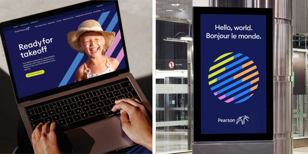
For Toronto Pearson International Airport, the mandate was to bring clarity back to a brand that had fragmented, without touching the existing logo. The result was a refreshed identity that included a flexible grid system, reminiscent of flight paths and vector lines.
The harder challenge was making the system work across every application, from bold welcome signage and social media to operational safety notices. “Design systems most often fail in everyday applications – high-volume, low-visibility communications that teams produce every day,” Stein says. BMD guards against this breakdown by pressure-testing unsexy applications during development, including forms, templates and wayfinding. “By building in flexibility early, we ensure the system remains robust, usable and engaging over time.”
For the National Ballet of Canada, the mandate was more fundamental. Tying into its 75th anniversary, the remit was a full brand identity redesign under incoming artistic director Hope Muir, with a brief to shift perceptions of the organization from exclusivity to openness and relevance. BMD’s anniversary campaign paired portraits of historical figures with images of younger dancers to signal continuity – an extension of a larger system already built for long-term adaptability. “We built a flexible toolkit combining bold colour, expressive typography, dynamic imagery and motion principles that can scale across every touchpoint without becoming repetitive,” Stein says. This system also includes motion templates and modular tools designed specifically for the in-house team.
The question of brand drift sits at the centre of BMD’s ongoing client relationships. Stein says the signs are consistent: a brand that no longer reflects current strategy, inconsistency across touchpoints, internal teams that find the system rigid or uninspiring, and an increased reliance on campaigns to compensate for foundational gaps. “A common mistake is assuming a new campaign will solve deeper brand issues,” she says. “If the underlying brand platform isn’t working, no amount of marketing activity will create lasting impact.”

Infiniti engaged BMD to elevate its brand while engaging a younger audience. BMD refreshed Infiniti’s wordmark, which had become disconnected from the brand’s aspirations. The new look also included a traditional Japanese colour approach, along with new typography and photography styles, for a brand that signals luxury and lifestyle.
Being part of the 72andSunny Creative Collective has expanded what BMD can offer clients without changing how it works, says Diane Mahony, partner & VP client services. “BMD remains a distinct practice, but we also collaborate on work across our teams. Clients benefit from our focused expertise, but they can also access the broader capabilities of the Collective when needed.”
Organizations looking to define a brand identity and activate it at scale benefit from the combination of BMD’s systems thinking and 72andSunny’s strength in unlocking possibility through rigorous optimism and cultural storytelling.
“For the world’s most ambitious brands, we’re designing lived experiences that drive how organizations behave, communicate and connect.”
CONTACT:
Diane Mahony
Partner, VP client services
mahony@brucemaudesign.com
The 2026 A-Listers:
Pomp & Circumstance: Taking big swings
Fuse Create: Turning heads everywhere
Klick Health: Built to think differently
Pendo: The next-generation agency partner
Spark Foundry Canada: Outside the lane